On December 1st 2020, a meeting took place, wherein Merkaba’s visual representation was discussed at length. The charity’s board alongside Ilan Adar then agreed upon a particular logo design: the Merkaba Heart. This motif is now omnipresent as part of the charity’s branding.
The design epitomises human transformation, a metaphor of inner change with said human represented as the golden mean.
The logo draws inspiration and takes after Leonardo da Vinci’s Virtuvian Man of 1490. The original 15th century drawing depicts a man in two superimposed positions with his arms and legs apart and inscribed in a circle and square. The limbs together form a symbolical 360 degree sphere – the immaculate geometrical object. The drawing illustrates a perfectly proportioned human body alongside a harmonious distribution of their energy.
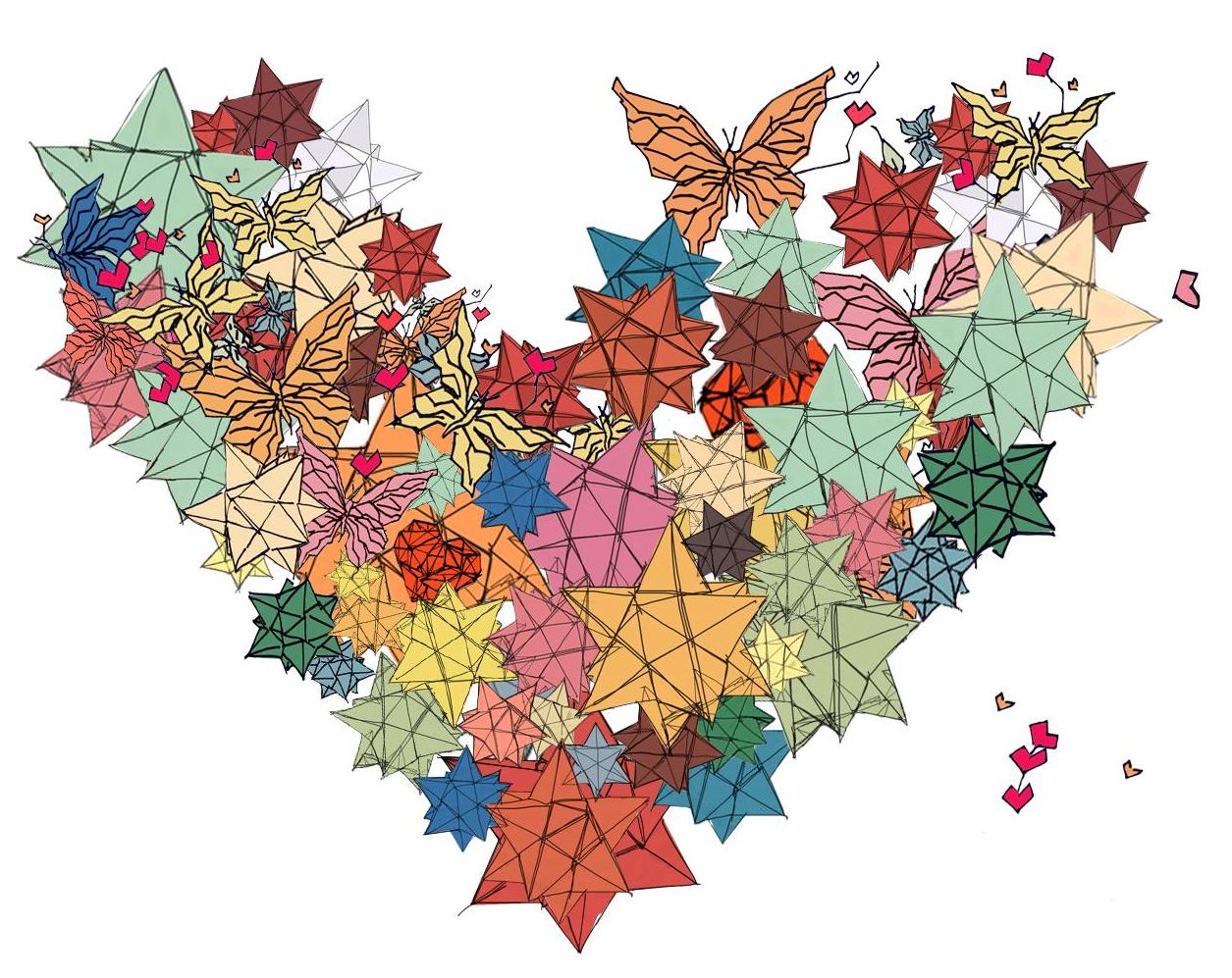

We hope that the synergy of the metaphorical ‘wings’ with the heart is experienced by all children; the future guests of the Merkaba Foundation Centre in Supraśl.